Five designers and a developer had a roundtable discussion about typography.
In our second installment of Talkin’ Typography, our designers get to talking about great branded fonts and Comic Sans, while our developer shares his thoughts on web-friendly typefaces.
What’s your favourite branded font?
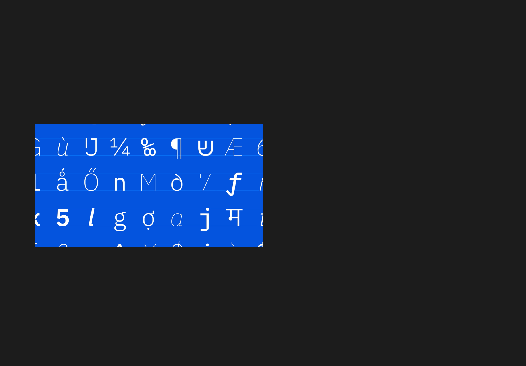
Ethan: The first one that came to mind is the font that IBM designed for their design system. I think it’s a pretty simple font, but if you look at it, you can see IBM as that font and they’ve done a ton of work. I remember digging into it a little while ago and they had this huge font family to pick from so they really went all out.
Image retrieved from IBM
)
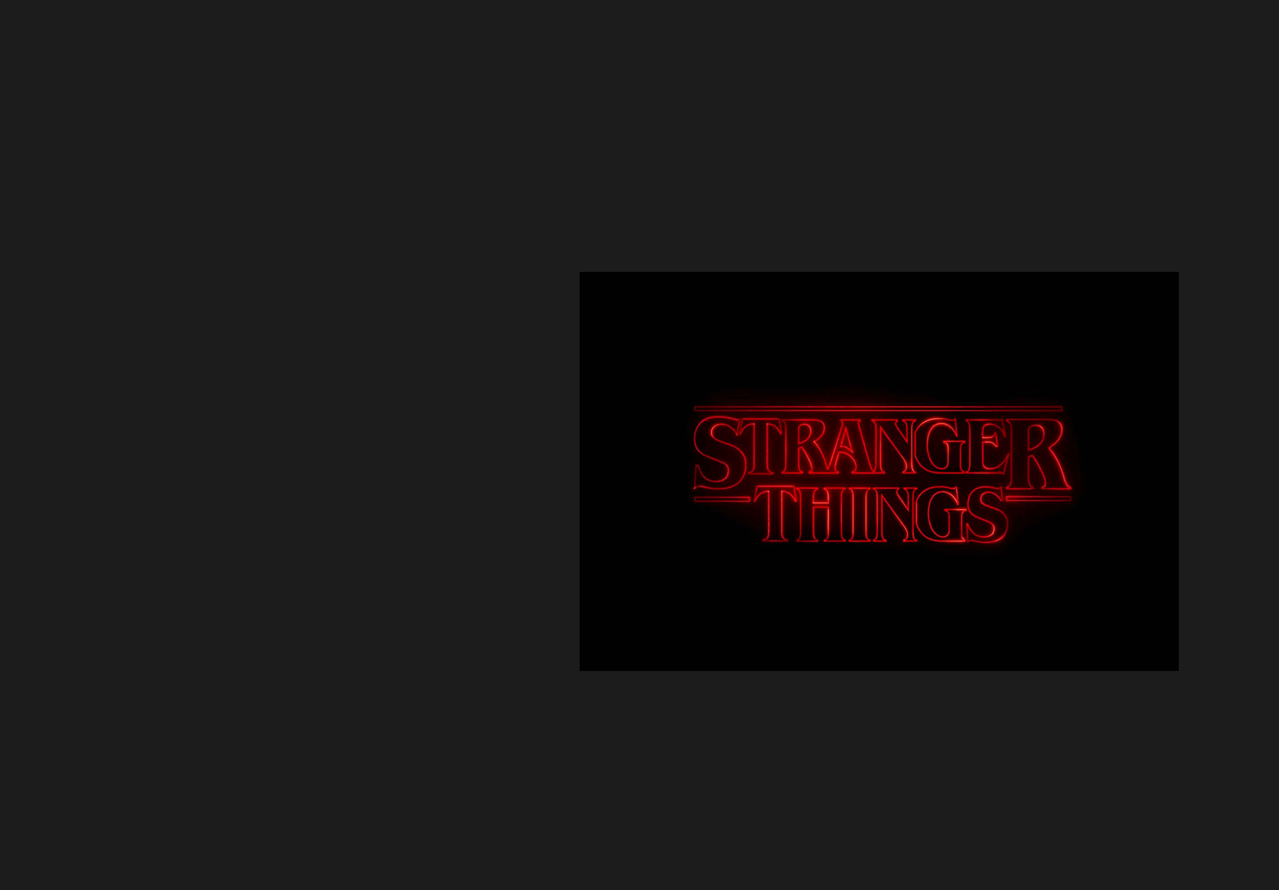
Chloe: I like the neon, retro look that the Stranger Things font has.
Image retrieved from Digital Marketing Institute
)
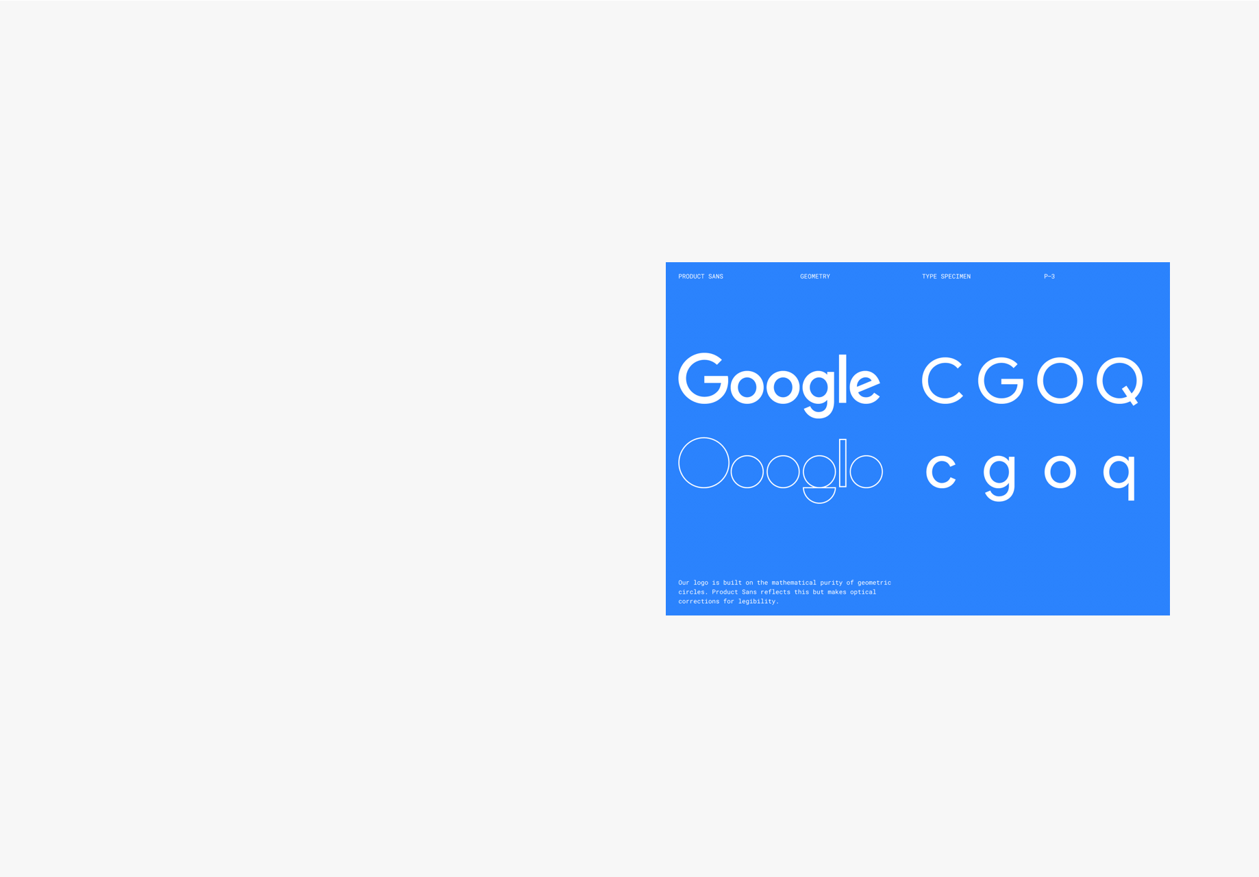
Kateland: I do really love when a brand owns a font and you could see any word by itself and know what that is. It could say cats and just be black on white and you’d know it’s Google. I just think it’s great when brands get to that point, it’s impressive, powerful and kind of cool to see that a brand can be so big and well-known that you see something so tiny and know that it’s them.
Image retrieved from Google Design
)
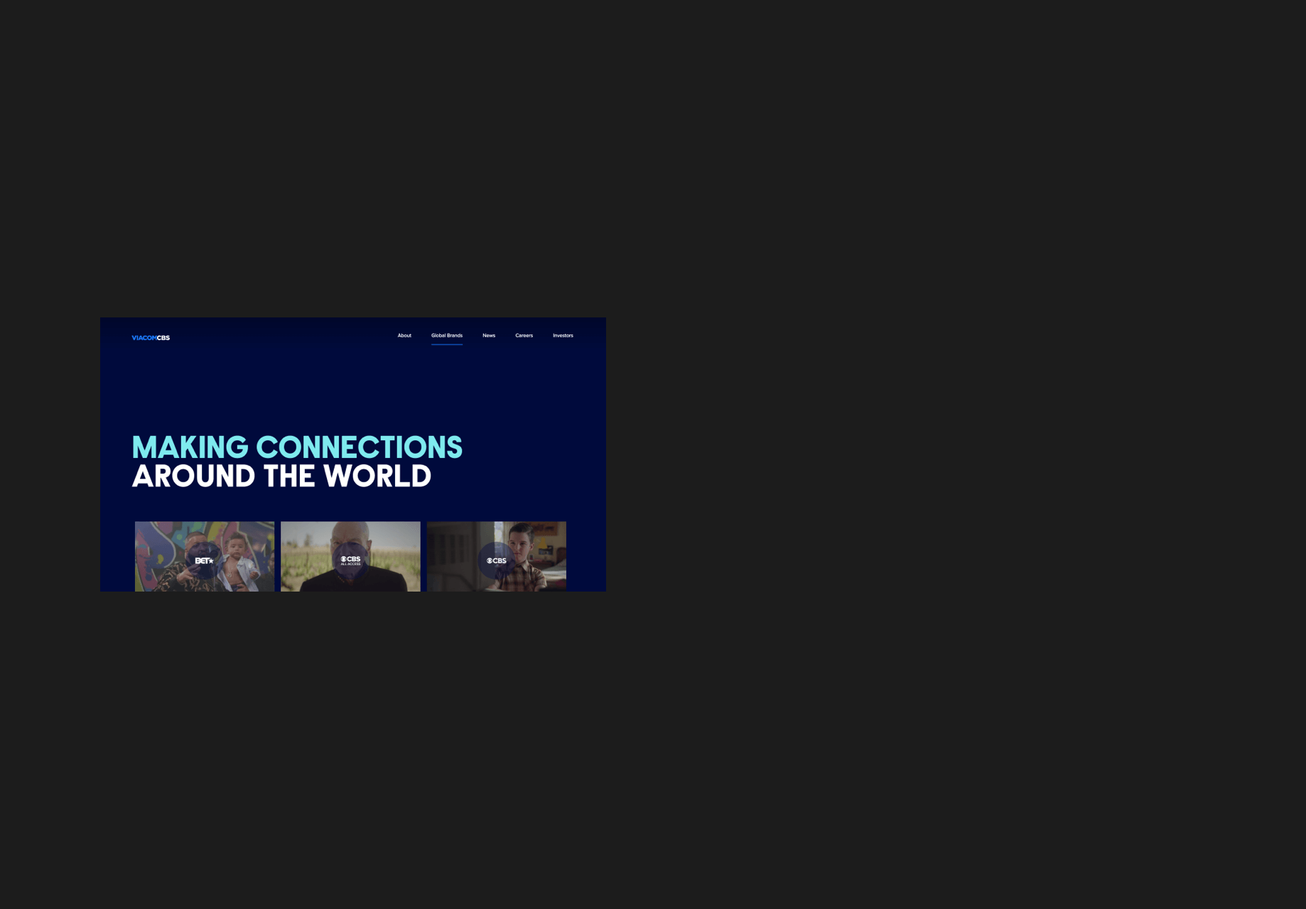
Ksenia: I’m actually with Kateland on this, I like it when a brand owns a font and I think the first one that came to mind was Uber. I know that they rebranded this very clean look and typeface which I personally like. I also love Viacom’s new typeface because it’s very versatile and not as condensed. They took one font and rebranded it in a way that reflected their personality. I don’t have a favourite font, but I do like it when a brand takes something and makes it personal.
Image retrieved from ViacomCBS
)
What are your thoughts on comic sans?
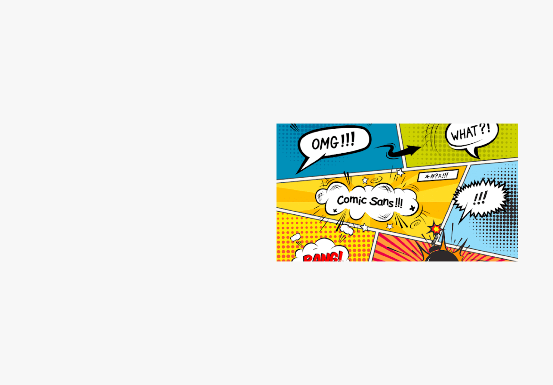
Ksenia: I just don’t like seeing this font everywhere, because it doesn’t convey a serious message. It looks like a comic book and that’s what it was designed for.
Image retrieved from Marlin Digital
)
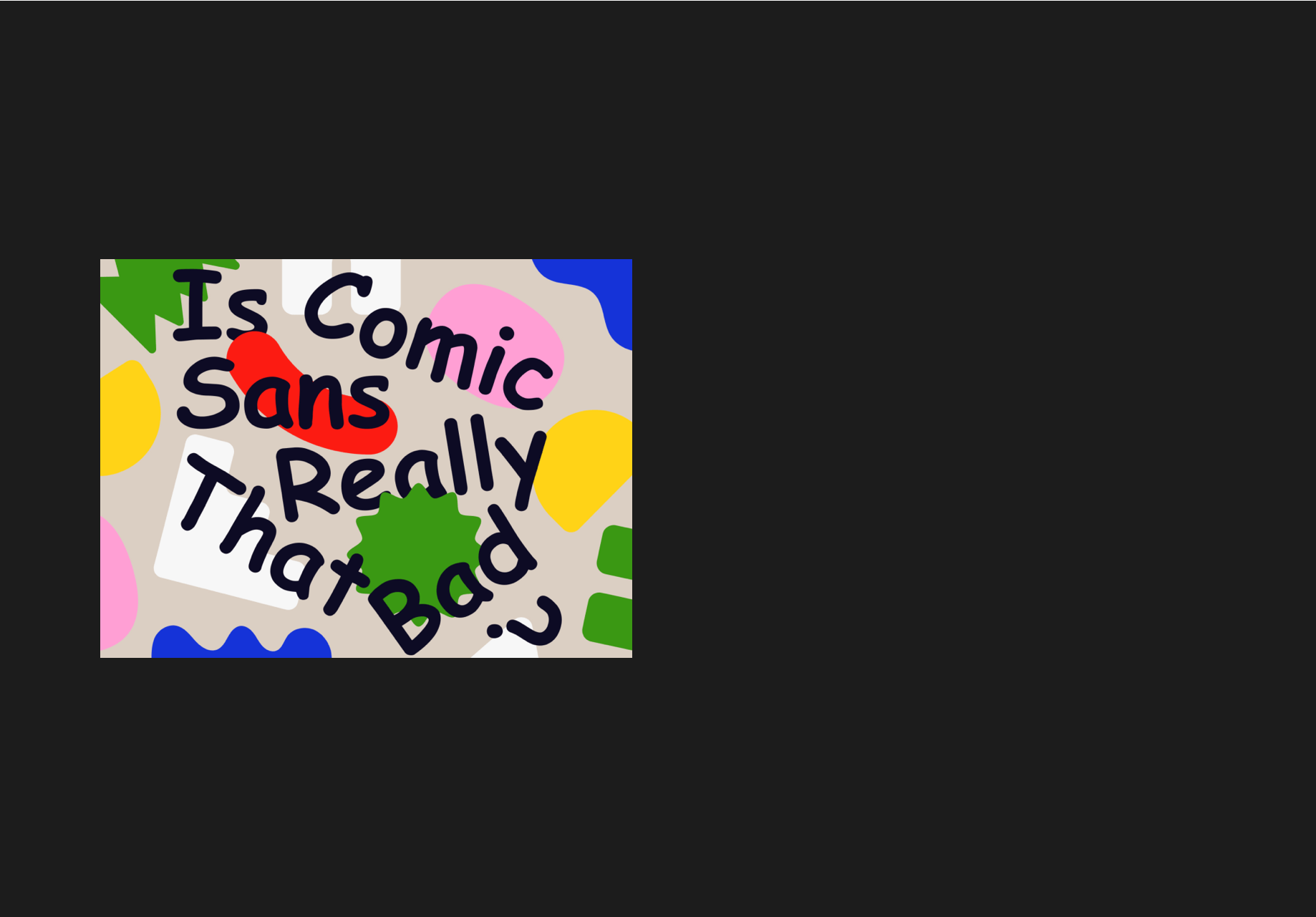
Jessica: Comic sans isn’t the worst because of accessibility; people with dyslexia find comic sans easy to read because of its irregular shapes.
Image retrieved from Dribbble
)
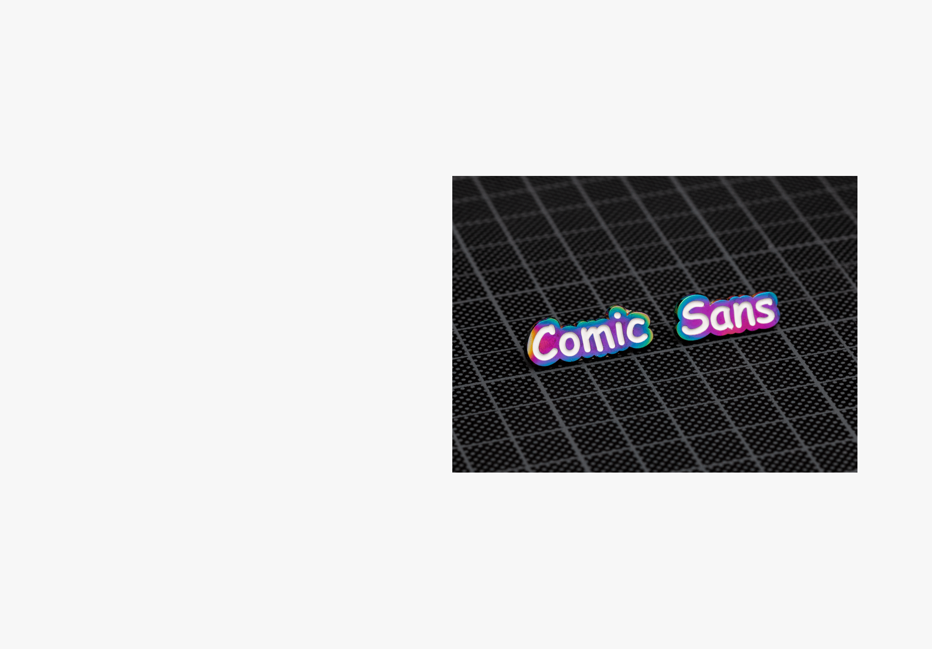
Chloe: I feel bad for it! I’ve got empathy for comic sans, people have been making fun of it for years. It’s kind of funny to me now.
Image retrieved from Dribbble
)
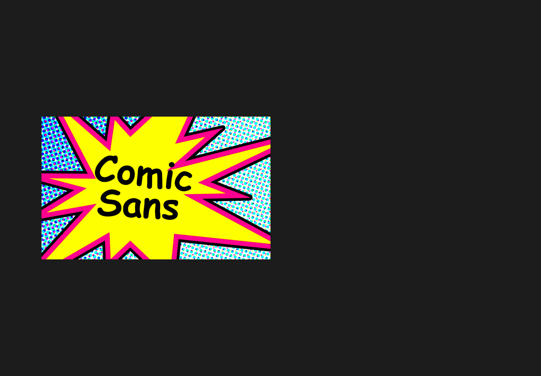
Kateland: I don’t think people really like it, I think it’s trendy to go against the grain.
Image retrieved from Live Science
)
Cam, as a developer, what’s the best web font?
Cam: I think one of the things that a lot of folks tend to ignore is the context for your font. A lot of people will just dive right into selecting a typeface and think they really love this font and then they see that font at 14 or 16 pixels on the web and it just doesn’t work and the readability isn’t there; for me, readability is king.
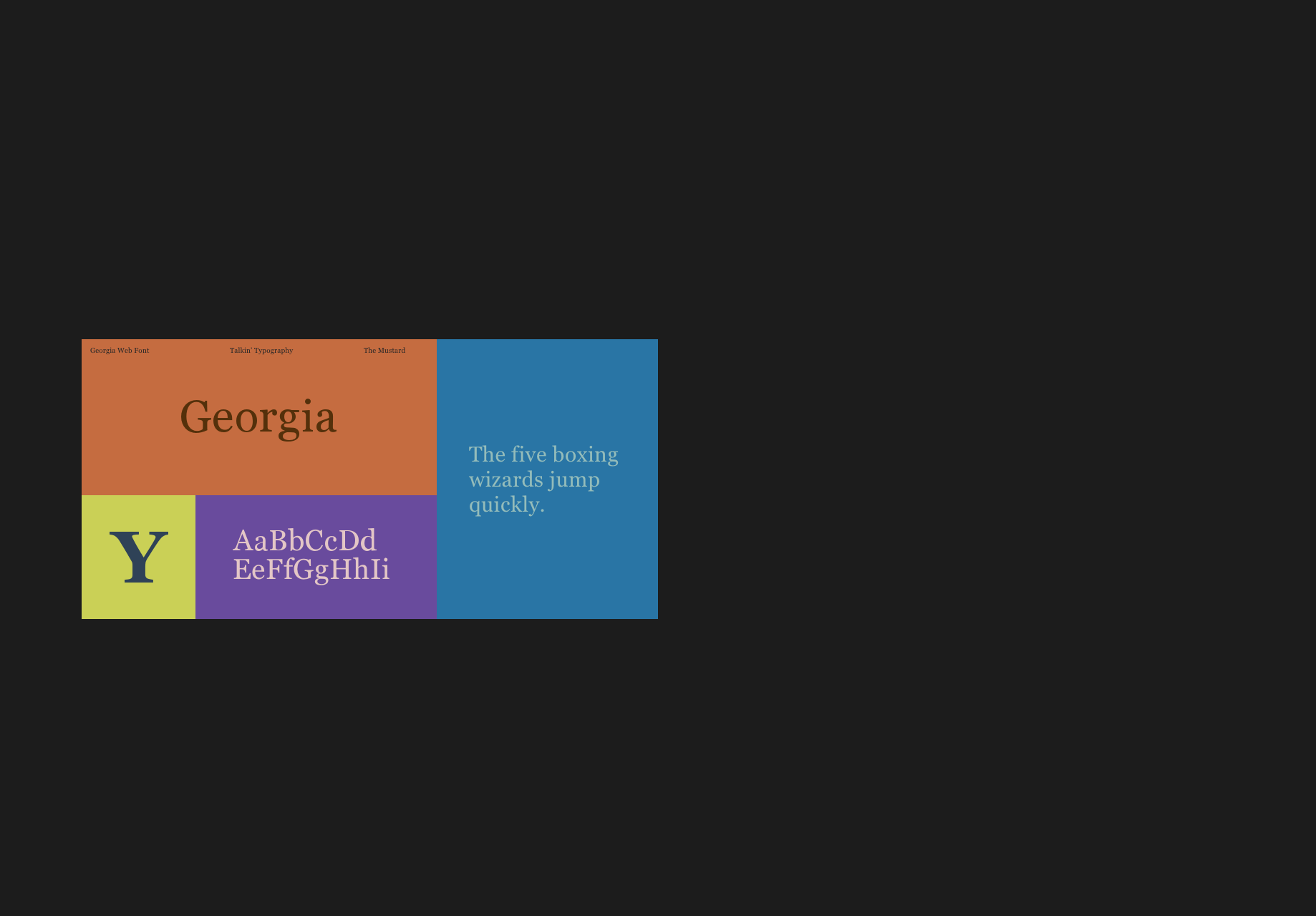
I’ve kind of undergone a bit of a transformation in the last few years. I used to love more modernist, clean sans serif fonts. Maybe I’m just getting old and my eyes suck now, but I’ve come full circle and have come back to loving old serif fonts. I think my favourite web font is Georgia. I love the bold weight of Georgia and it’s what I use for my personal branding.
)
What’s your favourite branded font?
Ethan: The first one that came to mind is the font that IBM designed for their design system. I think it’s a pretty simple font, but if you look at it, you can see IBM as that font and they’ve done a ton of work. I remember digging into it a little while ago and they had this huge font family to pick from so they really went all out.
Image retrieved from IBM
Chloe: I like the neon, retro look that the Stranger Things font has.
Image retrieved from Digital Marketing Institute
Kateland: I do really love when a brand owns a font and you could see any word by itself and know what that is. It could say cats and just be black on white and you’d know it’s Google. I just think it’s great when brands get to that point, it’s impressive, powerful and kind of cool to see that a brand can be so big and well-known that you see something so tiny and know that it’s them.
Image retrieved from Google Design
Ksenia: I’m actually with Kateland on this, I like it when a brand owns a font and I think the first one that came to mind was Uber. I know that they rebranded this very clean look and typeface which I personally like. I also love Viacom’s new typeface because it’s very versatile and not as condensed. They took one font and rebranded it in a way that reflected their personality. I don’t have a favourite font, but I do like it when a brand takes something and makes it personal.
Image retrieved from ViacomCBS
What are your thoughts on comic sans?
Ksenia: I just don’t like seeing this font everywhere, because it doesn’t convey a serious message. It looks like a comic book and that’s what it was designed for.
Image retrieved from Marlin Digital
Jessica: Comic sans isn’t the worst because of accessibility; people with dyslexia find comic sans easy to read because of its irregular shapes.
Image retrieved from Dribbble
Chloe: I feel bad for it! I’ve got empathy for comic sans, people have been making fun of it for years. It’s kind of funny to me now.
Image retrieved from Dribbble
Kateland: I don’t think people really like it, I think it’s trendy to go against the grain.
Image retrieved from Live Science
Cam, as a developer, what’s the best web font?
Cam: I think one of the things that a lot of folks tend to ignore is the context for your font. A lot of people will just dive right into selecting a typeface and think they really love this font and then they see that font at 14 or 16 pixels on the web and it just doesn’t work and the readability isn’t there; for me, readability is king.
I’ve kind of undergone a bit of a transformation in the last few years. I used to love more modernist, clean sans serif fonts. Maybe I’m just getting old and my eyes suck now, but I’ve come full circle and have come back to loving old serif fonts. I think my favourite web font is Georgia. I love the bold weight of Georgia and it’s what I use for my personal branding.