Good typefaces are important for getting messages across.
Ever wonder what five professional designers and a developer talk about? Yup, that’s right, typography. Part one of our two-part typography roundtable looks at Helvetica and working with clients.
What makes a font like Helvetica so great?
Kateland: It’s just so unbelievably satisfying to look at. It has so many weights and depending on what weight you use, you can have such a huge impact on the message and the tone of voice that you’re getting through the font based on that weight is beautiful. It gives me goosebumps, plus the film is brilliant and I’ve made [my partner] watch it about fifteen times.
Image retrieved from Dribbble
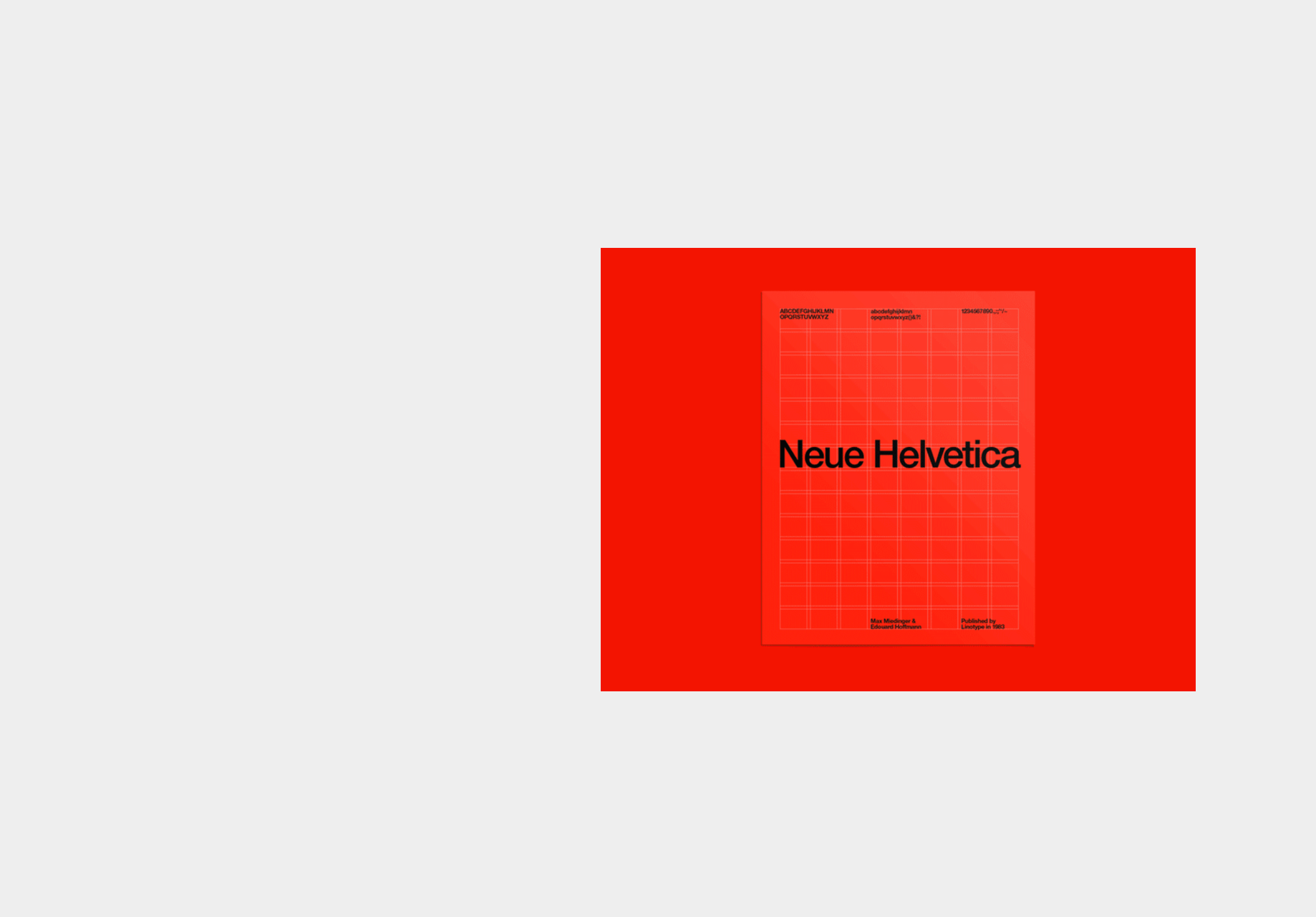)
Ksenia: I think that it’s a very universal font and if you don’t know which font to use just use Helvetica and you’ll never be wrong. I like this font and I agree with Kateland on this one, it’s very satisfying to see it. Even though I’ve noticed that a lot of brands use this font it never gets boring. It never looks old fashioned or boring, though, it’s completely timeless.
Image retrieved from Dribbble
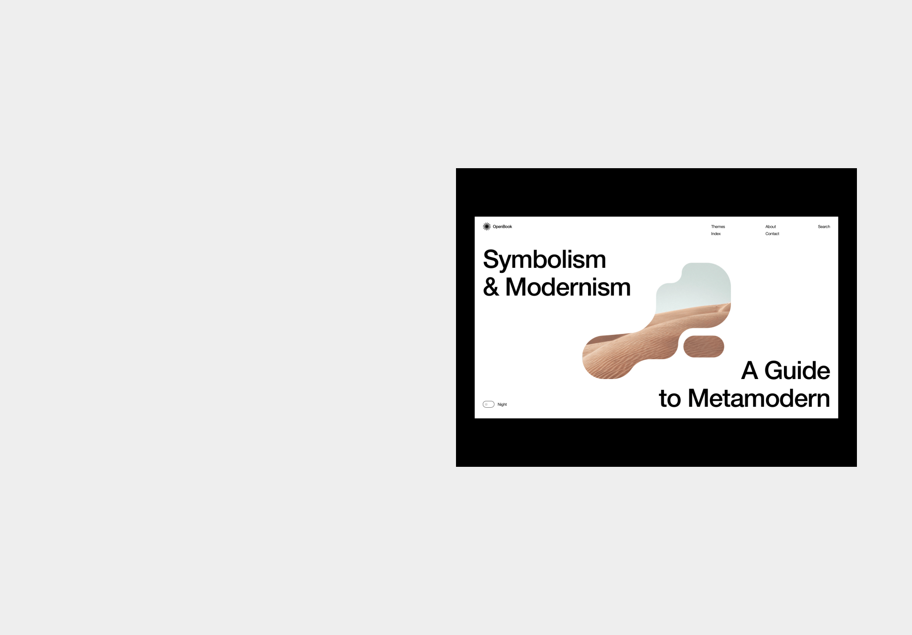)
Ethan: I have to agree, I think it’s timeless, and the cool thing about it is you can kind of put it into most situations and tweak how you’re using it and it’ll work. It’s something that just works no matter where you put it.
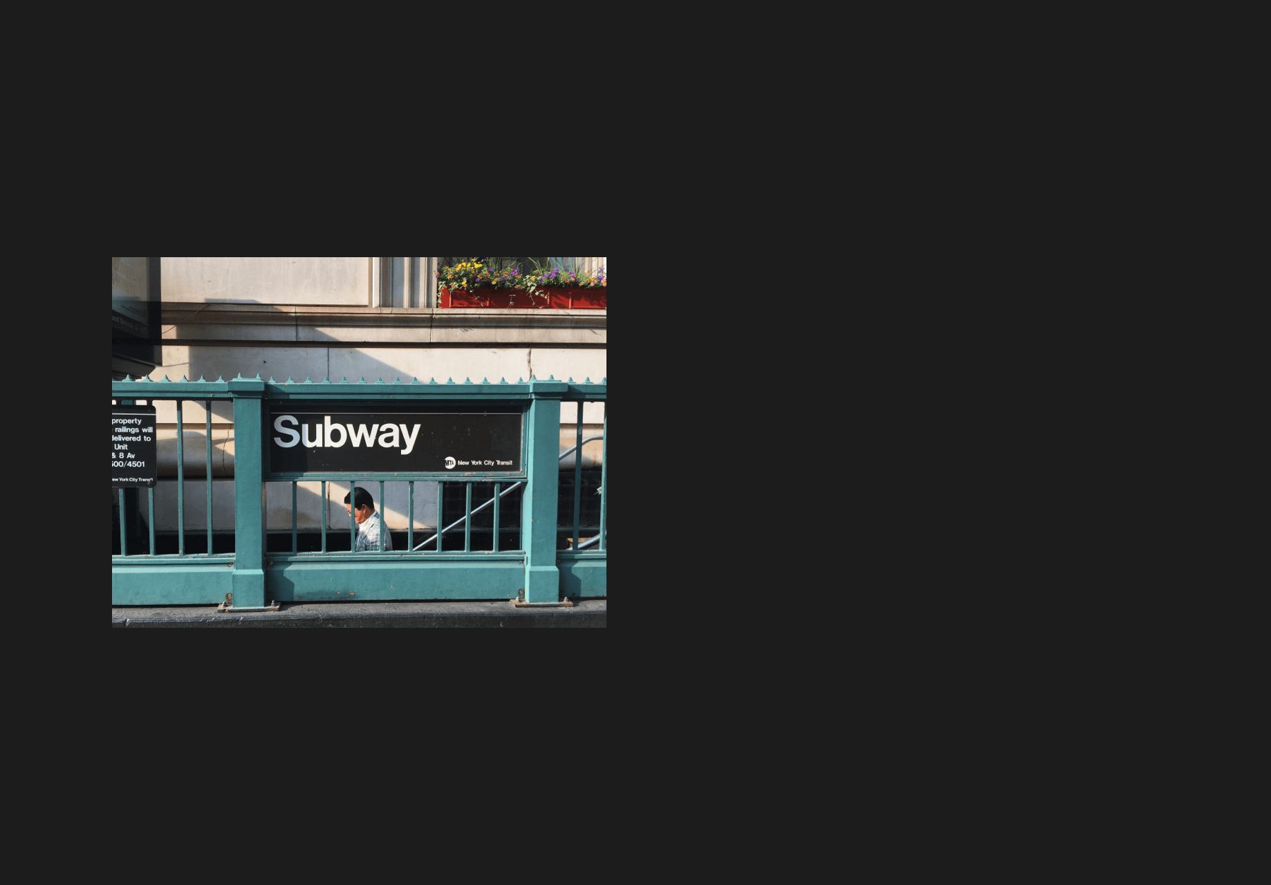)
Chloe: I also like that it’s always available as a web font. So if you’re constricted in terms of what you can do technically, it’s always there. It’s also always clean and readable. As Kateland said, it’s very variable, with tons of sizes and variations. I’ll also say that the documentary is great.
Image retrieved from Dribbble
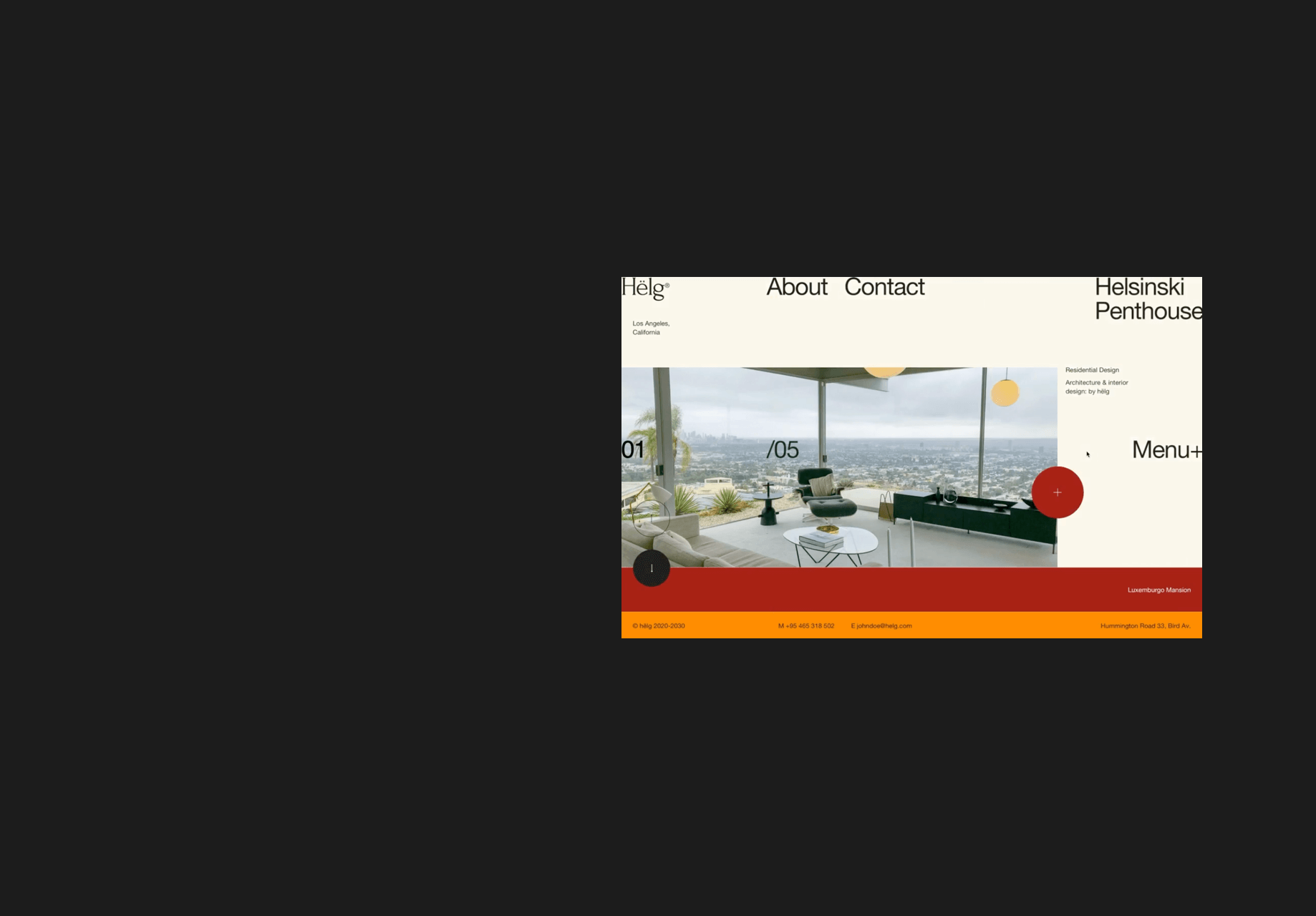)
Graham: It’s fine. For all of the reasons that everyone said it’s great, but I think it’s just like a chicken nugget. I don’t think about it, I don’t crave it, but if someone puts it in front of me, I’ll eat it. I like things that are more polarizing and try and evoke emotion and I think Helvetica evokes vanilla. It’s not a bad thing, I have nothing but love for it but I don’t think it does much to convey anything but information.
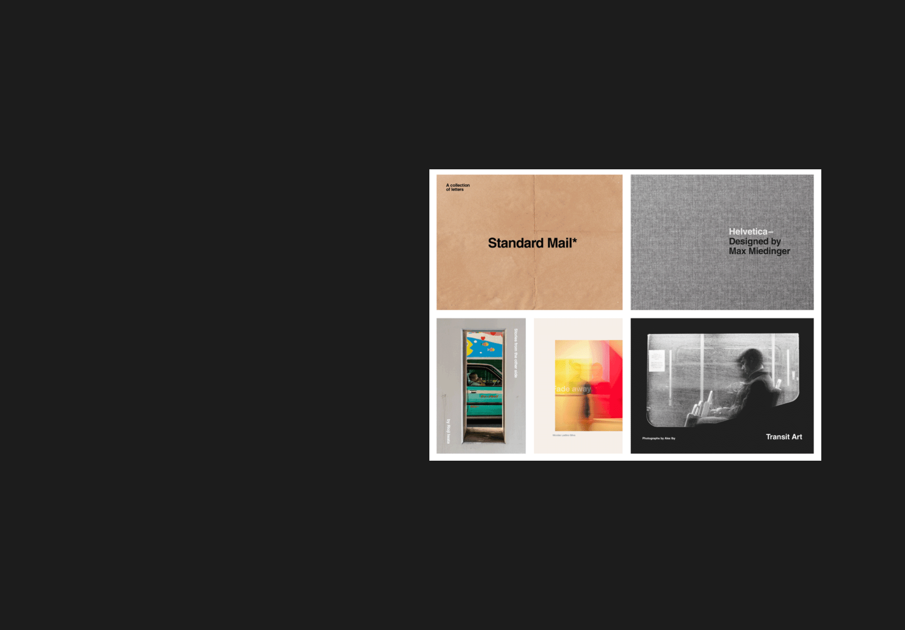)
When it comes to working with clients, how do you choose the perfect typeface?
Ethan: I think one of the things that I would do when I’m looking for a typeface, first of all, is just going with my gut reaction. So looking at it, I would think, does it sound like it fits with what I know about the brand? So if it was fairly aggressive, bold and the messaging was pretty hard-hitting, you can draw those same connections with certain typefaces. If it’s more elegant the typeface might be a little lighter or would suit a serif. But I do think it’s really important to check the versatility of those fonts and to make sure that if you’re using a display font that looks cool on print and billboards, how does it look on digital? Those are the two things I ask myself when choosing a typeface for clients; the gut feeling and how it performs on all of the mediums that it has to.
Image retrieved from Pangram
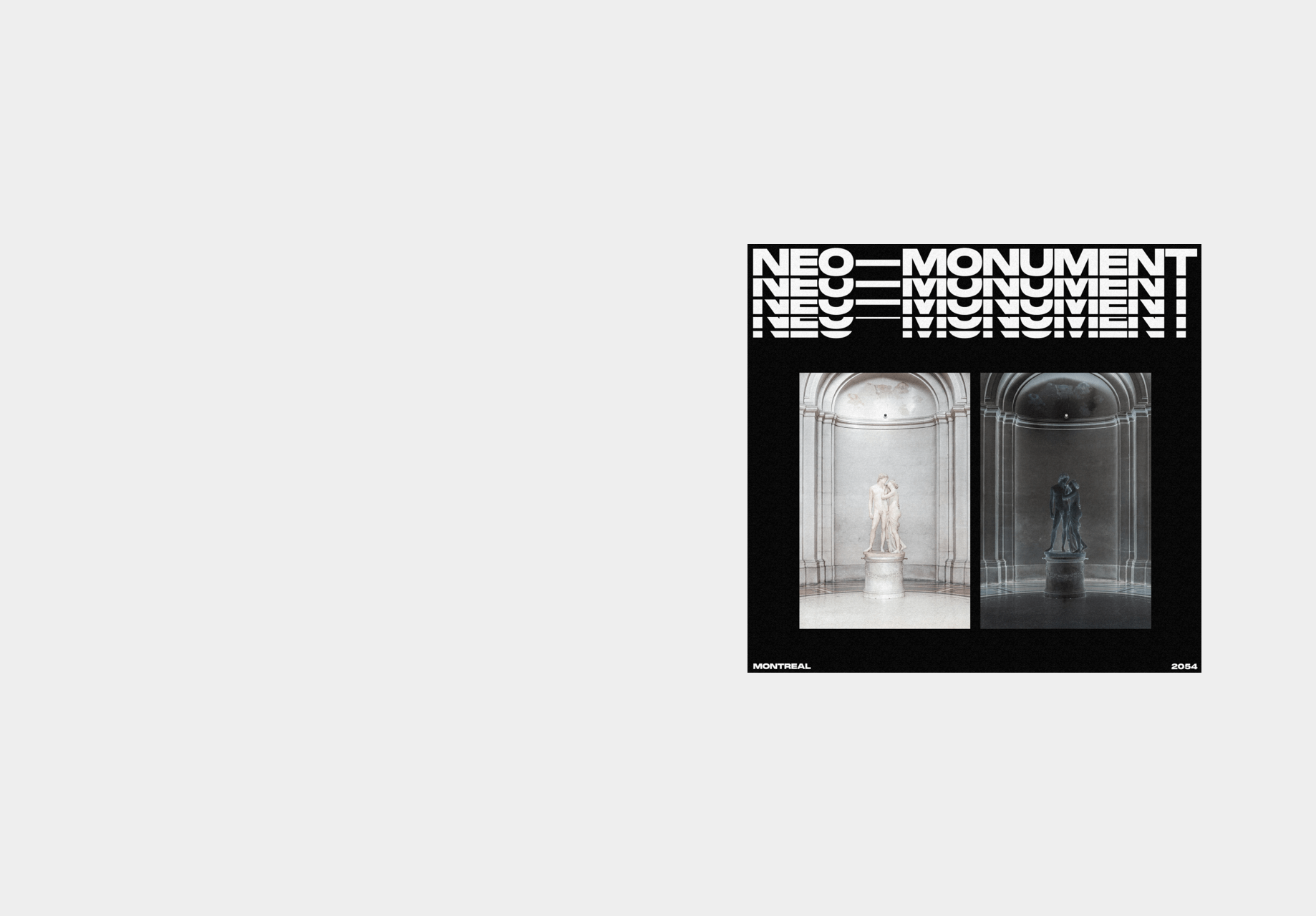)
Kateland: It’s so easy to get stuck in what you normally see and use and it’s very easy to think “I know this works,” but it’s about pushing yourself out of your comfort zone and finding different things. There are so many great resources such as YouWorkForThem which is a great website that has a lot of fonts and typefaces built by independent type designers rather than type foundries. The key thing isn’t just looking at the type specimen that someone will design, but it’s asking yourself, what words am I going to be using with this? Using that typesetter to see what it looks like. Typefaces have a personality, they’re like humans. They have a look and feel that evokes certain emotions and feelings. They’re all kind of subjective as well, so it’s just about exploring different things and seeing what works.
Image retrieved from Dribbble
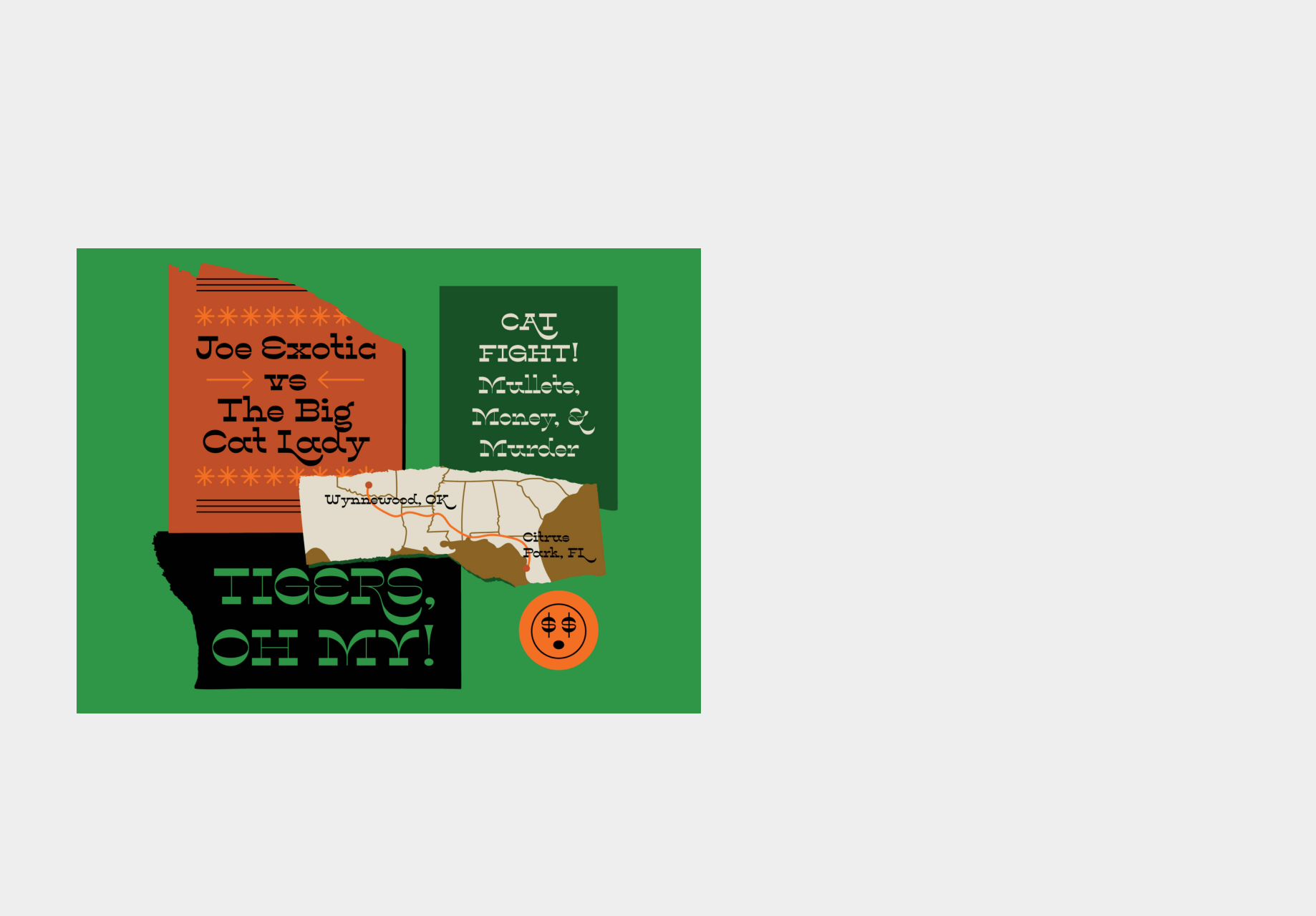)
Ksenia: I do that as well, I Google a bunch of websites that have different kinds of fonts and see which ones I like. Then, I see if that kind of font would convey the brand’s message. It’s all about exploring, but at the same time, making sure that it does reflect the brand because at the end of the day, it’s not about our personal opinion, it’s about the clients. If those fonts convey the messages and emotions that the brand wants to convey, then that’s the font, but again, it’s all about exploring.
Image retrieved from Pangram
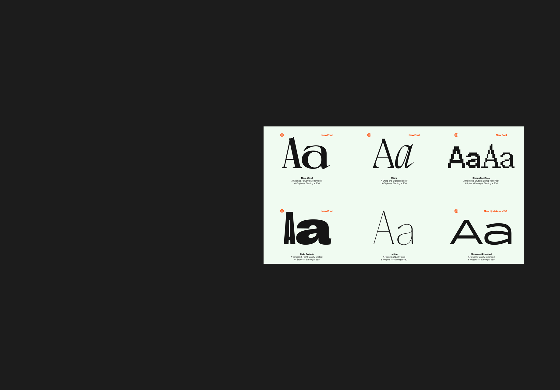)
What makes a font like Helvetica so great?
Kateland: It’s just so unbelievably satisfying to look at. It has so many weights and depending on what weight you use, you can have such a huge impact on the message and the tone of voice that you’re getting through the font based on that weight is beautiful. It gives me goosebumps, plus the film is brilliant and I’ve made [my partner] watch it about fifteen times.
Image retrieved from Dribbble
Ksenia: I think that it’s a very universal font and if you don’t know which font to use just use Helvetica and you’ll never be wrong. I like this font and I agree with Kateland on this one, it’s very satisfying to see it. Even though I’ve noticed that a lot of brands use this font it never gets boring. It never looks old fashioned or boring, though, it’s completely timeless.
Image retrieved from Dribbble
Ethan: I have to agree, I think it’s timeless, and the cool thing about it is you can kind of put it into most situations and tweak how you’re using it and it’ll work. It’s something that just works no matter where you put it.
Chloe: I also like that it’s always available as a web font. So if you’re constricted in terms of what you can do technically, it’s always there. It’s also always clean and readable. As Kateland said, it’s very variable, with tons of sizes and variations. I’ll also say that the documentary is great.
Image retrieved from Dribbble
Graham: It’s fine. For all of the reasons that everyone said it’s great, but I think it’s just like a chicken nugget. I don’t think about it, I don’t crave it, but if someone puts it in front of me, I’ll eat it. I like things that are more polarizing and try and evoke emotion and I think Helvetica evokes vanilla. It’s not a bad thing, I have nothing but love for it but I don’t think it does much to convey anything but information.
When it comes to working with clients, how do you choose the perfect typeface?
Ethan: I think one of the things that I would do when I’m looking for a typeface, first of all, is just going with my gut reaction. So looking at it, I would think, does it sound like it fits with what I know about the brand? So if it was fairly aggressive, bold and the messaging was pretty hard-hitting, you can draw those same connections with certain typefaces. If it’s more elegant the typeface might be a little lighter or would suit a serif. But I do think it’s really important to check the versatility of those fonts and to make sure that if you’re using a display font that looks cool on print and billboards, how does it look on digital? Those are the two things I ask myself when choosing a typeface for clients; the gut feeling and how it performs on all of the mediums that it has to.
Image retrieved from Pangram
Kateland: It’s so easy to get stuck in what you normally see and use and it’s very easy to think “I know this works,” but it’s about pushing yourself out of your comfort zone and finding different things. There are so many great resources such as YouWorkForThem which is a great website that has a lot of fonts and typefaces built by independent type designers rather than type foundries. The key thing isn’t just looking at the type specimen that someone will design, but it’s asking yourself, what words am I going to be using with this? Using that typesetter to see what it looks like. Typefaces have a personality, they’re like humans. They have a look and feel that evokes certain emotions and feelings. They’re all kind of subjective as well, so it’s just about exploring different things and seeing what works.
Image retrieved from Dribbble
Ksenia: I do that as well, I Google a bunch of websites that have different kinds of fonts and see which ones I like. Then, I see if that kind of font would convey the brand’s message. It’s all about exploring, but at the same time, making sure that it does reflect the brand because at the end of the day, it’s not about our personal opinion, it’s about the clients. If those fonts convey the messages and emotions that the brand wants to convey, then that’s the font, but again, it’s all about exploring.
Image retrieved from Pangram
Look out for part two of Talkin’ Typography where our designers will continue to discuss fonts, brands and more. Stay tuned!